Website usability and how to improve it
Usability – one of the “whales” on which SEO-promotion. You can offer the best products, but no one will order them if the site is inconvenient. Usability is a way to understand how easy a site is to use. The task of the web designer – to make sure that all visitors easily and quickly find the information they need.
With good usability, users will not only order goods and services, but will linger on the site, which will be a good signal for search engines. Google and other systems take this factor into account when ranking.
What is website usability?
The usability of a website is a term that describes how easy it is to use. This applies to various elements: menus, navigation buttons, pagination, the location of individual elements.
Usability shows the overall degree of convenience, the speed of achieving the desired result when browsing pages. The main task – to simplify user interaction with the site.
Why is it important to follow the principles of usability?
Users are not interested in how unusual and complex solutions you have implemented in your project. Website design can be innovative and the resource can win the award for “Most Beautiful Website,” but your customers won’t appreciate it if innovation gets in the way of convenience. It is more important for them to quickly find the “Buy” button, the feedback form and get recommendations of products that match their interests. These features will make users return to the site and move from the category of casual visitors to the segment of regular customers.
A poor user experience with a website is the enemy of e-commerce. Because of poor usability you can lose 20%, 50% or even 90% of customers.
The functionality of the website should be intuitive to understand. Today’s users don’t like unnecessary actions. Good usability – the key to increasing traffic and sales, increasing the average check. This will also help in promoting the site and increase search traffic. Not the least of these is hosting. Our hosting for Magento is already optimized for this system and does not require additional configuration.
What affects usability?
Usability depends on many factors. All of them are important in combination – you can’t improve usability by setting up simple navigation and discarding everything else.
- One of the most important points is adaptive design. Adaptive pages look right on all devices: a huge monitor, a laptop with a 15.6-inch display, a tablet, a cell phone. The arrangement of elements will be correct on any screen size.
- Content layout and layout. Usually users come to a website looking for specific information. Content should be easy to read, so font size and color also matter Blank space – another important element of the layout. It separates blocks and simplifies the perception of information.
- No technical errors. For the website to be usable, errors must be corrected. All proposed functions should run smoothly: buttons – to work, pages via links – to open, and products – to be added to the cart.
- Structure and navigation. The home page should clearly inform about what the website offers. The menu items should give an idea of the contents of the pages. The goal is for users to quickly find what they are looking for. A common way to measure how easy it is to find a page is to count the number of clicks it takes to get to it. The old rule of 3 clicks is no longer relevant and is only suitable for simple blogs. For a large online store or portal can be guided by 10-15 clicks.
Attractive design enhances visual perception and usability. The main trend in recent years is minimalism. Do not overload pages with images and decorative elements.
How to improve the usability of the site?

To assess the usability, testing. You may think the site is very simple and easy to use, but your users may have a different opinion. Only testing will show the real picture and help you find weaknesses worth working on. Below we give recommendations that will positively affect the usability of any site.
Work out the header of the site
The header is the very top of the website. It usually stands out well, and for good reason: it’s the first thing the user pays attention to. Consequently, the cap should give the visitor the most important information:
- The name of the company and the scope of its activities. For this are responsible logo, name and descriptor – a short phrase describing the services, such as “tailoring” or “electric scooter rental. These items can be located on the left or in the center of the screen.
- Elements of conversion, most often – the basket of orders, personal account, button registration and login to the account.
- Contacts. It can be a phone number or a feedback button. If a user wants to contact you, he will not have to look for a long time how to do it.
The header may have a menu, but it is not required. Today it is increasingly hidden in the so-called “hamburger” – 3 strips, click on which brings up the menu.

The hat should not take up much space. If in the past it was often placed images, but today web designers do not recommend doing so. The less graphic content on the page, the faster it loads in the browser.
It’s good practice to secure the header so that it doesn’t disappear when the page scrolls vertically. Take a look at how TutHost does it.
Work out the home page of the site
The home page is the face of the site. It should contain brief information about your products or services, to introduce the “hot offers”, but not overload the visitor with information. If you don’t know how to post content, try one of the templates in our builder.
The following information can be listed on the main page:
- A logo, name and slogan, if you have one (and if not, make one up – this will help customers remember you);
- clear navigation elements;
- a list of your services or product categories;
- promotional offers, discounts;
- brief benefits;
- If appropriate, you can place an infographic, for example, with the geography and number of completed projects;
- customer feedback as proof of your reliability;
- conversion elements and a call to action.
You should not put on the main page a detailed history of your company and talk about all the cases. There is an “About” page for this. If you have a large business with a long history, you can create a whole section of the menu with pages “Our team”, “Implemented projects”, etc.
Work out the navigation elements
Navigation helps users navigate the site and find the information they need. Navigation elements include:
- menu, which can be horizontal, vertical, or the already mentioned “hamburger”;
- breadcrumbs, which help the user understand which page he is on and go to the parent category;
- button “Top”, which allows you to return to the header of the site in one click.
Good navigation is impossible without a thoughtful site structure. Build a hierarchy of pages, create understandable categories. If you have a lot of products, divide them into subcategories. Use the usual places for navigation elements: cart and personal account in the upper right corner, menu – at the top or left, links to “About” page and “Privacy Policy” – in the footer. Experimentation is allowed, but don’t forget to test innovations.
Work through product pages
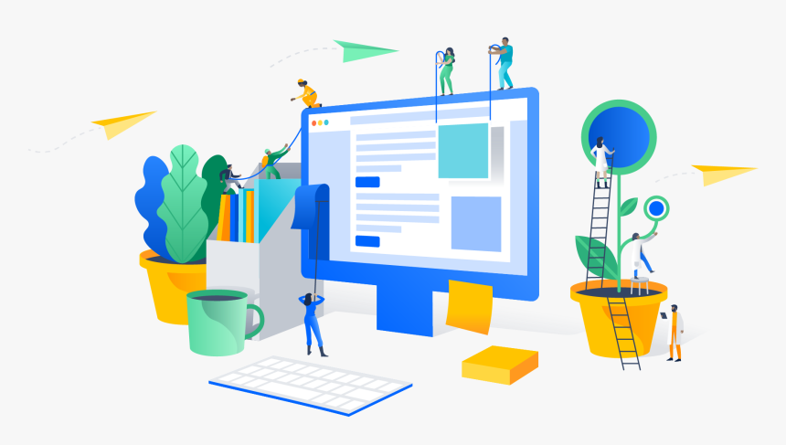
It is on the page of a product or service visitor makes the target action. Help him with that:
- Add more high-quality, zoomable images.
- Understandable characteristics and the ability to choose them. For example, shoe size, color of mouse pad, car tire diameter.
- Make the “Buy” or “Order” button prominent, but don’t overdo it – a red button on half the screen would look ridiculous.
- Add customer reviews. Especially useful will be the ability for users to insert their own photos and videos in the review. This information will be the last straw that will convince customers to buy the product.
- Use pre-sales and cross-sales. Resales are easy to implement with the block “With this product bought,” and cross-sales will be useful if the user has navigated to the card of goods that are out of stock.
Information about the product should be enough, but you do not need long canvases of text. Photos and videos will tell you more. In the text format is better to make the characteristics and a brief description for SEO-optimization page.
Work out the functionality of the order
Give the customer the opportunity to order quickly. Don’t make him fill out 20 form fields, go to new pages. The ordering process should be straightforward:
- the user clicks the “Buy” button;
- indicates full name, phone number, city and post office;
- clicks the “Checkout” button.
The fewer actions required of the buyer, the better. If you need to clarify the details, your manager can call this number.
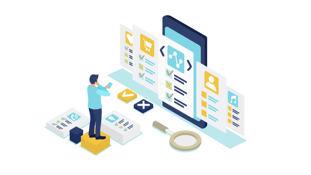
It is better to accompany the goods in the cart with a small image. Create a personal account for users, where the data will be stored. So you’ll increase the chances of repeat purchases: the visitor won’t have to enter his or her name and delivery address a second time.
Increase page load speed
Slow loading is one of the main reasons for the “rejection” of visitors. Today, no one waits 5 seconds for a page to load. It is important that pages load quickly on all devices, because today most people browse sites from mobile devices. You can check the loading speed of pages with different tools, but the most popular one is Google PageSpeed Insights. The tool shows the current speed and gives recommendations on acceleration.
Analyze the reasons that lead to slower downloads. Only by finding out what is “slowing down” the page, you can solve the problem. General recommendations for acceleration:
- Use image compression and modern formats (.webp, .svg);
- Remove unused plugins and scripts;
- Optimize your CSS and JS code;
- Use asynchronous loading of scripts, place them at the end of pages;
- set up the caching;
- Connect a CDN – content delivery network;
- Move the site to fast hosting.
High page speed is not only important for usability, it is one of the main ranking factors in Google, so pay attention to this indicator.
Conclusions
The key point to remember is that usability is a process. Regularly test the usability of your resources. You don’t have to do it every day, but be sure to test if you notice such signs:
- lower conversions;
- drop in search traffic.
Testing will help you understand if poor usability has caused problems. You can also check if you have changed the design of the entire site or individual elements. And if you need a site with good usability without long testing, use our designer – all templates are already tested.


